
All posts by Phil Starke
Judging an Art Show
I judged a plein air show in Kansas City, Mo this past week. It was a very good show benefiting Penn Valley Park. Its a great older park to paint in, the trees are large and old (the best kind to paint) and the awards were pretty generous, as well as treating the artists very well, hope they have it again next year. Best of Show was by Patrick Saunders 
When I judge a show I have a list of criteria that I follow, or look for, it can’t be a random selection of my personal likes or dislikes or what piece makes the best political statement.
I start with the composition or how the canvas is designed with the shapes or planes of a painting. Next is the use and understanding of values, then how color is used and lastly how creative or unique the view of the subject is.
You might think creativity and uniqueness would be the first criteria considered but a creative view that isn’t supported by an understanding of design, values and color won’t get the point across.
This way of viewing. (Or in my case judging) paintings doesn’t mean rigid restrictions. Understanding design allows you to make the composition simple or complicated, drawing becomes more about proportion and shape than about photographic rendering and understanding color allows you to mix colors that best represent the light instead of just copying what you see.
So a good understanding of the structure of painting allows you more freedom to express your self (what ever that means.). A painting with a solid foundation can lean towards abstraction. As a matter of fact a good representational painting should have abstract qualities in it.
Below are 2 paintings by Victor Higgins. He was a member of the Taos Society of Artists in the early 20th century. These 2 landscapes have a very strong design quality to them that, almost abstract but at the same time representational.


If you like this post
Zorn’s Edges
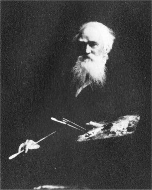
I was in New York a couple of weeks ago when the National Academy of Design had a show of Anders Zorn’s paintings and etchings. Simultaneously they had a show titled Zorn’s American Associates featuring John Singer Sargent, Augustus St. Gauden’s and John White Alexander. It was a really great exhibit. The only problem was I didn’t see it. I was busy teaching a workshop in Central Park just across the street. I’m not complaining. It was a very good workshop, Central Park is a great place to paint but the exhibit was so close yet so far away. Theres always the internet though, so I googled Zorn and looked at all the paintings on line.
What I really take away from Zorn’s work is his use of edges. We get carried away with realism (I’m speaking to myself here). We tend to get too literal, each area of a figure or landscape turns into a focal point and we end up with several little finished paintings instead of one.
When we look at a subject, landscape, still life, figure, we focus on one area, we can’t focus on everything at one glance. Thats how we should paint. The focal point should have the sharpest edges and other areas should soften especially in the shadows. Edges in the shadows should disappear while light edges, specially those against dark shapes, will be harder.
Below is a portrait by Anders Zorn. He uses a variety of edges to make the form come out at the viewer or sink back into the shadows. Mainly he does this by losing the edges in the shadow and keeping them harder in the light.

image1
In this close up of the hand, in the same painting, you can see he obliterates the edges on the shadow side and when you contrast this with the harder edges on the light side the form it takes on a 3 dimensional look.

image2
In this painting of a woman he uses softer edges to simplify and to show form on her face. Her black dress has no hard edges except where the light hits it, the shadows are simplified and show no edges.

Anders Zorn: Omnibus I. NM 6810
In the detail of the face he uses hard edges to show the cast shadow on her face and the soft edges to show the form shadow on her face. Cast shadow have hard edges and form shadows ( where the form gets darker as it goes around) have softer edges.

Anders Zorn: Omnibus I. NM 6810
One last image of a Zorn self portrait. I have arrows pointing to the hard edges. The edges on the collars are hard because they are light and are coming towards the viewer. The hard edge near the eye is a cast shadow so it is harder than the other edges around the eye. The forms that recedes onto the shadow has lost edges. See more of Zorn’s work here: Anders Zorn: Sweden’s Master Painter

Anders Zorn: Självporträtt.NM 1510
If you like this post
For Email Marketing you can trust.
When Photographs Look Like Paintings
We’ve all heard of paintings that look like a photograph, not a compliment by the way, but how about photographs that look like paintings? I don’t claim to know anything about photography but I was at an Ansel Adams exhibit at the Oklahoma City Museum of Art and was amazed at his work and the subtle value changes in his photography.Many of the pieces reminded me of artist’s paintings I’ve long admired.Here is an Adams photograph, Autumn North of Truchas, New Mexico.

ansel_adams_autumn_north_of_truchas_new_mexico_c_1941_d5662515h

Autumn Oaks
The subtle value changes and the sense of light and atmosphere reminds me a George Inness painting Autumn Oaks. There are similarities in in the shapes but I’m talking about the similarities in atmosphere. I don’t have any knowledge of developing photographs but Ansel sure figured it out. I read a little bit about how he manipulated the exposure process to get the effects he wanted. He also shows me, as a painter, that I can achieve a sense of atmosphere and light by working with values and very little color.
In this photograph by Adams ( I don’t have the title) the atmosphere reminds me of Thomas Hills’ painting of Royal Arches and Half Dome. Same silvery light and atmosphere, even though the Adams is a black and white.

adamsx

Royal Arches and Halfdome
In this last photograph, Aspens near Santa Fe, the value changes remind me of an E. Martin Hennings painting Sunlit Aspens. The use of subtle value changes and sense of light on the trees are similar.

628×471

Aspen Sunlit
I’ve never really had an interest in photography until I understood a small amount of what it took to develop the work the way Adams did. I still don’t have much interest beyond using it as a tool for painting but I have more respect for good photography.
Ansel Adams: 400 Photographs presents the full spectrum of Adams’ work in a single volume for the first time, offering the largest available compilation from his legendary photographic career.
If you like this post,
For Email Marketing you can trust.
Color Schemes
The last couple of weeks in our online classes we’ve be studying color schemes. Using color combinations from the color wheel to achieve harmony, mood, feeling and other artsy sounding stuff.
As an exercise it helps us to get out of our color comfort zone, the sky isn’t always blue and grass isn’t always green. We also become more familiar with the colors on our palette, mixing colors combinations we haven’t thought about using.
The main reason I ewould recomend it is it keeps us from copying color, especially from photographic reference. The color in photos are boring at best and can be very high key and chalky or too opaque and black. Color schemes help us to mix identifiable colors that suggest light and atmosphere and to focus on the value of the color, which is more important, since were locked into a certain set of colors.
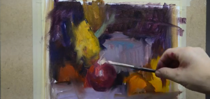
Below is a color sketch I did using yellow orange, violet and blue. This is a split complimentary scheme where I’m starting with yellow orange then use the 2 colors on either side of its compliment, blue and violet. Also below is the photograph that I used, it’s rather boring color wise but with a certain set of colors I can create a different feel then what the photo gives me.


I have to decide which color will predominate when I mix a color and focus on getting the right value. The sketch is small (5×7 or close to it) and simple. I focus on the large planes, working out color combinations, about a half an hour. Remember these are studies or exercises, not finished pieces, to get you out of your comfort zone.

Below is a picture of the palette. I mixed the 3 colors in the color scheme and then mixed some value changes for each color.

This is a painting I did from a reference near Santa Barbra, CA. In this painting I’m using a split complimentary shceme of red violet, blue violet and yellow.

Its a good exercise to learn what the colors on your palette can do, and it does create a desired mood to the painting. Edgar Paynes’ book on composition is a good source for understanding color schemes and to think more about the colors you want to use instead of copying what you see.
If you like this post
Online Mentoring News
 This week in our Online Mentoring Class we looked at how to approach painting without overdrawing. We have the need as artist’s to over draw, trying to control the painting too much. It makes the painting look stiff and “filled in”, more photographic.
Detail is what the camera is for, our work should look like paint not a photo, so brush work is more important then detail. The reference I used is an Eagle Dancer that I photographed at the Grand Canyon several years ago. I want to focus on the action or gesture of the figure not the detail or outline.
 In the drawing stage I want to use less outline and more mass. There are no outlines in nature so I don’t want to over use them. I can use outlines to adjust or refine the mass but the mass or shapes are more important than outline. It also makes it easier to draw and achieve accurate proportion when I use mass. I start with a violet and green background then I use a rag with paint thinner on it to wipe out the mass of the figure then use the negative shape of the background to refine the shape. No outline.
 In this stage I’m blocking in the darks, trying to see them as definite shapes, and not be too picky.
 I continue to block in dark and light shapes, being careful with the shapes but not looking at detail, if there is any detail it comes in the end.
 In this stage I start looking for subtle variations of color in the large shapes. I’m careful not to loose the value of these shapes, its more of a color change not a value change.
 Now i’m starting to break the large shapes into smaller shapes, looking for highlights and accents to give a sense of detail without over doing it.
 Lastly I want to think about edges, looking for a variety of hard and soft edges to make the form come forward or recede or look more flat or rounded.
If you like this post
Online Mentoring Class
In my Online Mentoring class this week I’m demonstrating techniques for painting trees. Trees are like figures, they have a certain anatomy to them and need to be studied not just copied.
John Carlson ( John Carlsons Guide to Landscape Painting, a book you need to have if you don’t) says: “It is curious how ones feelings about trees change, in proportion to ones appreciation of their importance and dignity as live beings. Trees are individual beings: they can be comic, heroic, tragic to the sensitive, practiced eye of the landscape artist”
There is certain character to trees that we need to capture and it takes a lot of practice and the more you enjoy painting trees the better you will understand them.

This is the reference that I’m using. Its a stand of cotton woods in Tubac AZ where I just finished teaching a plein air workshop. The goal here is to SIMPLIFY. Not just the shape but also the values and color.

The next two stages are spent trying to find the right values to represent the large shapes or planes around the trees. The values have to have the right relationship with each other for the whole painting to work. After the large value relationships are established I can start massing in the tree with the goal of showing the gesture and movement of the tree. Trees are rarely straight theres a lot of movement to them and not just the trunks but how the masses of foliage are shaped and flow through the painting. Its important also to use thick paint, you can’t do much with thin paint.
[table id=1 /]In images 4 and 5 I’m using positive and negative shapes to give the tree the final shape I want. This is easier to with thick paint. I also am using broken color to break up the larger shapes. I’m careful to use more color changes and not as many value changes which leads to too much detail.
[table id=2 /]
Moran’s Green River Cliffs

green river cliffs
A couple of years a go I made a painting trip to Wyoming with a friend of mine, Jeff Love. We painted some in Utah and Dubois, WY and around the Wind River Valley. I taught a workshop around Dubois, Jeff painted and looked for grizzly bears
On the way up to Dubois we went through Green River, WY and the minute we saw those sandstone cliffs ( I’m assuming there sandstone) we recognized Thomas Moran’s painting, Green River Cliffs, which is in the National Gallery of Art. The cliffs are real distinctive and stand out from the Green River which is a tributary of the Colorado River.
Moran came through Green River in 1879 and sketched the river and cliffs. He was on his way to Yellowstone with William Henry Jackson a photographer of the west.

moran painting
The first image shown is the watercolor sketch he made (one of many) and the second image is the oil painting he painted in 1881 ( also one of many) back in his studio in New York.

view of green river
I also show the photo we took from the spot where Moran painted or sketched. I know it was the spot because we found a small plaque telling us it was. You can tell from the photo that we just missed the same lighting that Moran had in his oil painting, the sun was going down and the light was blasting the cliffs. In our photo the sun was gone, no light blasting the cliffs, but it is a pretty good view of what he saw. He did leave out the prefabricated bank building on the right, good artistic move on his part, but the rest looks pretty close. It’s a good lesson on improving the composition in the studio. You can see the changes he made in the cliffs compared to the watercolor. I also don’t rule out the possibility that he used some of Jackson’s photos, it would certainly be tempting. Of course the photos would have been black and white. Which is a good thing otherwise his studio paintings would look like ours when we depend on photographic color too much. You can enjoy more of his work in: Thomas Moran
Phil Starke Online Workshop Schedule

WEEK 1 | VALUES AND PLANES
WEEK 2 | BLOCK IN COLOR AND BROKEN COLOR
WEEK 3 | ATMOSPHERIC PERSPECTIVE
WEEK 4 | CENTER OF INTEREST
This course is designed for artists at every level and in every medium.
August 19, 2013 – September 16, 2013
Visit the Tucson Art Academy Online to get more info and register.
Tucson Art Academy Online – Phil Starke Workshop Schedule
PHIL STARKE
AUGUST 12 -SEPTEMBER 9, 2013
MORE INFO AND REGISTRATION here
WEEK 1 | COMPOSITION AND VALUES
In this lesson the focus is to SIMPLIFY. Simplify the shapes, make sure the proportions are correct, and reduce the values of each shape. Complete with one dark and one light value, then block in the local color by using the color wheel to determine the correct color.
WEEK 2 | BLOCK IN COLOR AND BROKEN COLOR
In this lesson we focus on breaking up the large areas of simple color. The broken color is a color change, not a value change. This will be an important part of this weeks lesson.
WEEK 3 | BRASS AND GLASS
This week the focus will be how to approach different surfaces. Metals, such as cooper and brass, are very reflective. We will look for the extreme values. The highlights and accents while keeping the color stronger with middle values. We will finish by looking for subtle color changes and softening the shapes edges.
WEEK 4 | IMPRESSIONISTIC APPROACH
This approach is geared towards stronger color and center of interest. Think big and simple. Shapes not contour. Instead of starting with a value drawing and color block in we will use loose transparent washes of color with very little, to no white. This will help you to loosen up, not worry so much about your drawing skills, and stay away from rendering.
More info and registration here.
Brinton Museum in Sheridan, WY

Dana
The Brinton is a small art museum at the base of the Big Horn Mountains. It was built by a rancher in the 1880s and converted to the museum in the 1960’s. The permanent collection includes E. W. Gollings, Frank Tenney Johnson, Remington and Russell, George Bellows and more. The grounds are beautiful, as well as the surrounding acres.
The current show that was hanging was titled American Impressionist in the Rockies. It’s the work of Fra ( pronounced Fray) Dana, a little known artist in Sheridan County at the turn of the century and artists she studied and painted with. It includes a portrait of Dana by William Merritt Chase, who she studied with and landscapes by Joseph Sharp and E. W. Gollings. The museum has several shows through out the year.
The Museum is worth seeing if your in the area, the surrounding landscape is worth the trip. You might enjoy seeing more paintings of women of the west. Here’s a book that does that: Independent Spirits: Women Painters of the American West, 1890-1945

Fra Dana “Turkeys”

E W Golings

Sharp