
All posts by Phil Starke
Value Paintings
 If I’m having trouble with color in a painting it’s usually not the color that’s the problem, it’s the values, the dark, light and halftone relationships. The hues can always vary but the values have to represent what the light is doing in the painting. So a good exercise is to use a palette of white, Ivory black (or an ivory black and ultramarine blue mixture or indigo blue), yellow ochre and Indian red. This limited palette forces you to think in term of values instead of color because you don’t have enough color choices to worry about. When we work with a large color palette it becomes harder to find those subtle value changes that define form and depth so a very limited color palette helps you to focus on values, especially those subtle value changes.
Notable Quotes To Share
 I want to share these two thoughts on beauty with you:
“There is nothing ugly; I never saw an ugly thing in my life: for let the form of an object be what it may, light, shade, and perspective will always make it beautiful.” (John Constable)
“Beauty is not democratic; she reveals herself more to the few than to the many.” (C.S. Lewis)
Painting and Teaching in Sheridan, Wyoming
 I recently taught a workshop in Sheridan Wy, which is a small town nestled against the Big Horn Mountains. Here the class is spreading out to paint on Goose Creek Road. One of the problems is trying to pick a view; there is so much to paint there.Sheridan is full of history, ranches and beautiful landscape. The Big Horns aren’t as dramatic as the Rockies to the west but they have a subtle beauty to them that I find more interesting. The mountains are more rounded and have rocky outcroppings that pull your eyes over the shapes.
There are also layers of valleys and streams with huge cottonwoods and winding

dirt roads. One of the problems is getting permission to travel and paint on private land but everyone was very accommodating and happy to have us there. A lot of the mountain roads were pretty rough. I made a mistake of driving to Sheridan in a car to save gas money and ended up blowing out a couple of tires.
The students were well prepared, they had no problem with the roads, heat and bugs, no one wimped out half way through the day.
There was some complaining about the amount of green we had to paint but that’s plein air painting in June. It makes you appreciate winter colors. I do hope to return and do some more painting and teaching there, maybe in the fall and winter. It’s a very friendly, paintable place.

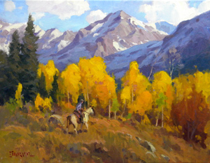
This 10×10 demo was near Goose Creek Road, the spring flowers were in abundance and helped cut some of the green. I wanted to demonstrate that you can focus on the values and temperature and push the color any direction you want.
This photo is a good example of the cloud shadows that floated by every day. They helped break up the mountains and introduce different colors.
Unprimed Hardboard Masonite Boards
 If you like painting on a toned board, a good surface is a masonite, or hardboard panel, without any gesso or primer. The boards have a nice warm tone to them and I find it easier to judge values on a darker surface. They do need to be sealed so I use a clear shellac, sprayed or brushed on. I use this for smaller boards, 10 x 12 and smaller. The surface gets too slick with larger boards.
Home improvement stores carry these boards and they will cut them for you. I do recommend the spray shellac, it’s easier and less messy. I apply 3 coats of shellac about 10 minutes drying time between each coat.
Online Still Life Workshop Coming Up Soon

I’ve got an online workshop coming up on July 15 through the Tucson Art Academy Online.
WEEK 1 | COMPOSITION AND VALUES
In this lesson the focus is to SIMPLIFY. Simplify the shapes, make sure the proportions are correct, and reduce the values of each shape. Complete with one dark and one light value, then block in the local color by using the color wheel to determine the correct color.
WEEK 2 | BLOCK IN COLOR AND BROKEN COLOR
In this lesson we focus on breaking up the large areas of simple color. The broken color is a color change, not a value change. This will be an important part of this weeks lesson.
WEEK 3 | BRASS AND GLASS
This week the focus will beContinue Reading
I’ve Joined Pinterest
 Many of you visit and are a part of the sharing website “Pinterest”. I’ve joined the Pinterest community. My boards so far include: “Artists to Study”, “My Artwork”, “Books”, “Artist Materials and Supplies”, and “Instructional Videos”. So if you’re a part of the Pinterest community, click on the Pinterest button to the left to start following me on Pinterest.
Do You Paint What You See?
 When we paint, either from a photo or from life, are we painting what we see, trying to match the colors or are we painting what we know?I suppose we do both, trying to identify colors we see and match them, but I think the more you paint the more you try to paint what you know, using colors that give you the best effect of light or mood despite what you see. If your goal in painting is to reflect the beauty that’s around you then you want to use colors that work best.
I realize that I can’t come close to copying what God has created. But with knowledge of value, color temperature and how the colors interact with each other I can capture a sense of what I’m trying to show the viewer. By understanding the color wheel ( not just for 1st graders ) I can learn about color combinations that create different moods, mix cleaner color instead of just mixing to match what I see. If I use the 12 colors as a starting point for each object or plane of color I have a better chance of achieving color that works.
Its helped me to make my own color wheel with the colors on my palette to get a better sense of what I can mix and think in terms of what I’m trying to achieve instead of just copying.
New DVD Release Announcement

I’m pleased to announce my newest DVD set from StarkeStudio.com. This 5-Day Studio Workshop focuses on the essential studio skills to produce better paintings and work more creatively and effectively during your time in the studio. Each DVD teaches a different subject, but they all build upon one another to provide solid teaching of essential studio skills.
DVD Lessons included in this Workshop:
1. “Understanding Values” – 57 min.
2. “Understanding Brushwork” – 52 min.
3. “Giving Your Painting Depth” – 50 min.
4. “Understanding Edges” – 59 min.
5. “Understanding Your Color Sense” – 56 min.
Bonus: FREE 6th 44-min. DVD!
“Studying These 5 Elements in the Paintings of Noted Artists” – 44 min.
As a special, free bonus I’ve added a 6th DVD in which I teach from paintings of noted artists and how they used these same principles in their work. I’ll show you how they produced beautiful paintings using these elements.
Available to order by mail, or by direct download.
Visit StarkeStudio.com for more information.
From Looking Good to Looking Gray
Sometimes when I come in from painting outside my piece will look grayer or more muted than it did outside. I do have a natural bent to painting darker ( I think everyone has a tendency to paint lighter or darker) plus the light is so different inside than out. The light here in the Sonoran Desert is so intense and I think I’m painting with saturated or cleaner color and I’m not. So, since our work is viewed inside instead of outside I’m adjusting my color mixing slightly. I’m keeping my colors a little stronger outside, not much but enough so that when I go inside they tend to read better. I’m not using as much of the compliment in each mixture. I still paint what I see ( to some degree, its more painting what the light is doing instead of matching color) but with a little more caution in mixing each color.
New Videos Added to “Front Row Seat”
 Three new 20-minute videos have been added to the “Front Row Seat”.
- “Cottages”
- “San Miguel Street”
- “Street Cafe”
- Chickens
- Herd of Cattle
- Mountains & Lake
- Painting A Head
- Snowy Field
- Sunlit Adobe Building
Stop by and check out the paintings and videos.