Category Archives for Tips & Techniques
Scraping Your Panting Off When Things are Going Well
Scraping the paint off your canvas doesn’t always mean you’ve goofed up. Scraping is a good tool to use between stages of a painting. When you’re outside and are quickly blocking in a painting with thick paint because thicker paint gives you a better suggestion of light than thinner paint and makes a bolder statement, you can use a palette knife to scrape an area that you want to refine and it’s easier to refine over thinner paint. Scraping dosen’t ruin the color, value, or shape, it just gets rid of excess paint. It also teaches you not to fall in love with an area too soon.
In the studio I scrape between the block in stage and the broken color stage or if I have to stop in the broken color stage or if I have to stop painting for the day and don’t want the painting to dry with thick paint yet, I can go in with a palette knife and lightly scrape excess paint off and not lose the drawing, value or color.
Drawing: Is It A Tool Or An End In Itself?
 Obviously the answer is both. Artists have always drawn whether as preparatory studies for working out problems in a painting, which can become finished pieces in themselves,as a habit to sharpen our ability to see, or as finished pieces of art. Most artists though have a craving or desire to record what they see, and using graphite, charcoal or pen and ink are spontaneous ways of doing that.
  I’ve drawn a lot in my years of trying to figure out who I am as an artist. I’ve also had stretches where I don’t draw much and my work suffers for it.
Most of my drawings are preparatory, trying to figure out compositions, exploring different ways of seeing scenes from life or photographic reference. Studying different artists and how they draw  is essential. It’s a way to see into artists thoughts and struggles. And don’t confuse elaborate finished work as being more important then spontaneous, quick gestures which usually have more insight and freshness to them.
I’ve posted drawings from some of my sketch books used for drawing from life. Some are in hotel lobbies, airport terminals and malls. They are primarily drawing for drawing’s sake. There is a joy you get from just drawing when you are responding quickly to what you see.
The Artist’s Handbook – Slow Down the Drying Time of Oil Paint


Usually, if I’m trying to alter the drying time of oils, it’s to speed it up to meet a deadline or to make changes over dry paint. But once in a while, like in portraiture or figure painting, it’s nice to slow down the drying time to achieve subtle changes over a longer period of time. Oil of Cloves is one way of slowing the drying time. It’s a preservative that’s used to cover up the odor of decomposition. It has a pretty strong odor but it’s tolerable. A few drops in a paint mixture retards the drying time. Ralph Mayers’ book The Artist’s Handbook of Materials and Techniques: Fifth Edition on materials talks about other ways of retarding color as well as answering every question you ever had about artists materials. It’s an exhaustive manual on techniques old and new as well as supplies and materials.
Every Artist Should Have A Dog
As an artist I have a lot of deadlines, shows and galleries wanting work and wanting it tomorrow. So it is real easy for me to put off little things that keep my eye sharp like sketching from life, either a model or outside. I went to an indoor ceremony where cameras were not allowed and sketched for a few hours, forcing myself to see only the action and simple shapes. The mall or a restaurant is a good place for that. Doing thumbnail drawings outside for design and composition is also important, simplifying large masses and values helps to see the overall design which is what holds a painting together.
 That’s where the dog comes in. My kids have a dog and since they don’t walk him anymore, that chore has fallen to me. A 45 minute walk that I don’t have time for. I finally realized it is a great opportunity to do thumbnail composition sketches with a 5 x 7 sketchbook and conte crayon or 6B graphite pencil. The dog doesn’t let me stay in one place for more than a few minutes so I don’t get too detailed.
Every Artist Should Have A Dog
As an artist I have a lot of deadlines, shows and galleries wanting work and wanting it tomorrow. So it is real easy for me to put off little things that keep my eye sharp like sketching from life, either a model or outside. I went to an indoor ceremony where cameras were not allowed and sketched for a few hours, forcing myself to see only the action and simple shapes. The mall or a restaurant is a good place for that. Doing thumbnail drawings outside for design and composition is also important, simplifying large masses and values helps to see the overall design which is what holds a painting together.
That’s where the dog comes in. My kids have a dog and since they don’t walk him anymore, that chore has fallen to me. A 45 minute walk that I don’t have time for. I finally realized it is a great opportunity to do thumbnail composition sketches with a 5 x 7 sketchbook and conte crayon or 6B graphite pencil. The dog doesn’t let me stay in one place for more than a few minutes so I don’t get too detailed.
Using Brush Strokes to Show Form
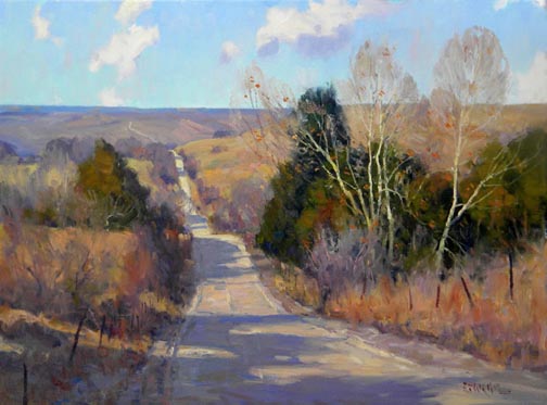 Since painting is done on a flat surface and the goal is to make your subject look three dimensional, it’s important how your brushstrokes lay on the canvas. Using value changes gives flat objects form and so does temperature change — warm colors come forward and cool colors recede. Hard and soft edges do the same thing, softer edges recede to the background and hard edges stick out and stay in front. Strokes that follow the slope of a hill or mountain help in showing the shape and strokes that follow the shape of an arm or leg do the same thing. Long horizontal strokes make a distant field lay down and recede and contrasting short, choppy strokes in the foreground makes grass and shrubbery stand up and come forward. So think in terms of modeling with the brush.
Topical Video Art Lesson “Mixing Color”
There are certain parts of the landscape that are easy to see and mix color for; a clear blue sky, summer green grass. But most colors in a landscape are not that easy to figure out like the color of a tree trunk, the shadow on the side of the mountain. Colors that seem gray are hard to mix. “Color Wheel & Color Charts” explains the key to mixing color is to get away from trying to match the color that you see and try to paint the effect of the light, which would be; look for the value first, then the temperature and last of all look for local color. Of course you to start with a color to get the value and temperature and that’s where the color wheel comes in. The color wheel gives us the 3 primary colors, 3 secondary colors and 6 in-between colors and if I’m using a limited palette of primary colors and pick the one color on the color wheel that is closest to the color I want to mix then I only have 1 or 2 colors left to choose from, this makes the process easier.
For me mixing color is the “art” part of painting. In “Thought Process of Mixing Color” I talk about how color is the emotional response to what we see. Which is why painting outside is so important, color from a photographic reference just isn’t as exciting. So as often as you can practice seeing and mixing color outside so that when you do paint inside you still have the same color sense as being out of doors. Our emotional response to color should be quick, without too much thinking, which can make our paintings look mechanical or stiff, but underneath these fluid, easy looking brush strokes is the framework for good color responses, the process that becomes second nature after enough practice. Visit StarkeStudio.com for more information regarding this Topical Video Art Lesson.
Painting into a Dry Painting
 When a painting dries, the color tends to go flat. The lights and darks get duller and flatter. So when you want to paint back into a dry painting you have to do something to bring the colors back to their original state and value. There are several options you can use.
 Retouch Varnish can be used and comes in spray or brush-on form. The smell of the varnish is pretty strong and over-powering.
“Expressive Brushwork in a Landscape” DVD
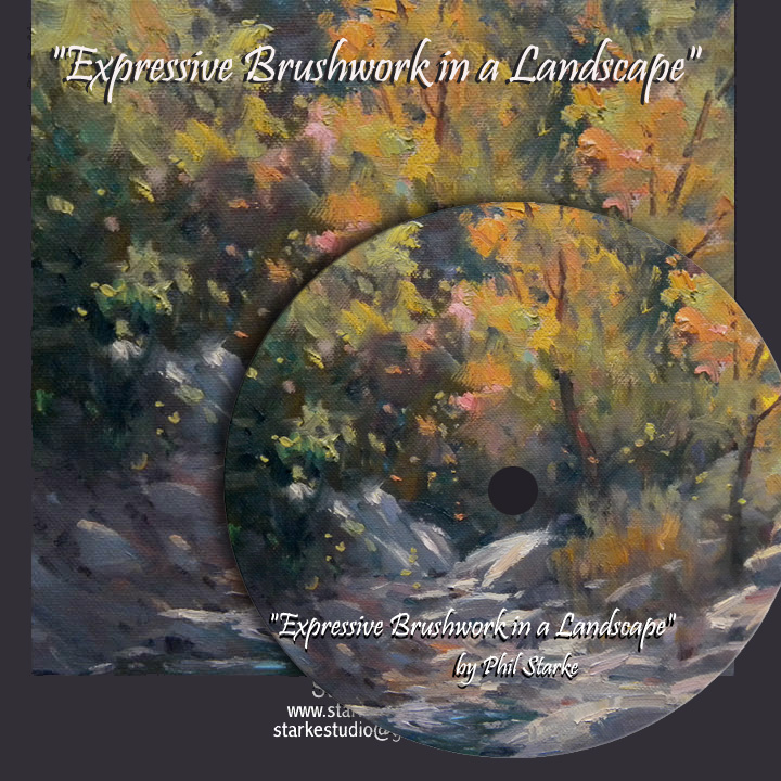 My full length feature DVD, “Expressive Brushwork in a Landscape” focuses on the use of brushwork to give your painting more life and energy and teaches how to use brushstrokes to give your painting dimension and direction of form. I’m please to be able to have the “picture-in-picture” effect so you can watch me as I mix my color on the palette while I’m working on the painting. Many tips and insights are passed along as I produce this piece. Check out the free preview on the Starke Studio website.
Create Depth in an Overall “Green” Painting
 Last November I went out to Petroglyph Canyon to paint. It’s not really called that but it is near some Indian petroglyphs and I can’t find an official name so I gave it one. It’s in a long meandering wash near Saguaro Park West with canyon walls that get higher the further back you go. I was there a couple of years ago with a class and we spotted a mountain lion watching us from the cliffs. So I always think about the lion when I paint there — puts a little more excitement in outdoor painting. My goal, I always try to have a goal when I paint outside, was to create depth in an overall green painting, pushing greens cooler and lighter in the distance and stronger darks and color in the foreground. The change is subtle and I wanted to push the difference without being too obvious. That takes a lot of observation and comparing the background darks with the foreground darks, seeing a strong value and temperature difference. And this time I didn’t see the lion.