
Category Archives for Tips & Techniques
New Videos Page on Starke Studio Website
 I’ve setup a new Videos Page at my teaching website, StarkeStudio.com.
Now, with my videos on one page, it’s easier to play them without a lot of back and forth .
Easy video players are all lined up to allow you to see, at a glance, which video you’d like to play. Visit StarkeStudio.com and check out the new players.
Using A Palette Knife Plein Air

One of the many problems with painting outside is time, there’s not enough of it to finish our painting and get it all down before the light moves. One solution is to limit your scope of the subject, just paint what the light is doing to stuff.
But another solution is to find a way to block in the big planes of a landscape faster and one way to do that is to use a palette knife. The knife forces you to think simpler, bigger and faster. You can’t mess around with washes and thin paint with a knife, it forces you to make a decision and put it down. You also can’t pick around with detail when you use a knife, its not flexible enough.
Then, after you have the large areas of dark and light blocked in you can come back in with a brush to drag in broken color, soften edges and knock down some of the distractive palette knife strokes. It gives your painting more spontaneity and sense of color. The problems come when you don’t separate the values enough or keep your color clean.
Touching Up A Field Sketch in the Studio
 Obviously there are no rules to what you do to a plein air painting in the studio. My plein air work is primarily practice and gathering material for larger paintings (along with photographic references). I like to keep most of these pieces to judge progress in my work over the years and as a file for painting material.
The plein air process is so different from studio painting, more of a quick response instead of a planned painting so I don’t want to kill that feel in the studio. But I will look at a few things once I bring the painting inside — one is edges. I decide where I can soften or harden edges to create more depth. Another is contrast — small, dark accents or light highlights to pop the contrast. Third would be to knock down detail if I was overly excited outside and added too much.
Using Canvas Boards
Students ask me often if canvas boards are worth messing with, do they get in the way of improving their painting skills, or prevent them from moving ahead. I think canvas boards are great. If you’re starting your painting career you need to cover as much canvas as possible. Buy them by the box and cover hundreds of them. They’re cheap, you can use them and toss them or if you paint something half way decent on one you can soak the back with water and peel the canvas off and glue it to hardboard. The cardboard has acid in it and will eventually damage the canvas. I had a great Uncle that painted in the 20s and 30s, used canvas boards and they’re still in good shape.
When the canvas boards get bigger than 14 x 18 they tend to warp but the smaller ones are great to practice on. You won’t worry about ruining or making mistakes on expensive canvas. I use them for color studies for larger painting. The canvas isn’t the greatest but it’s fairly absorbent and has a good tooth for smaller paintings.
New Topical Lessons on Starke Studio Web Site
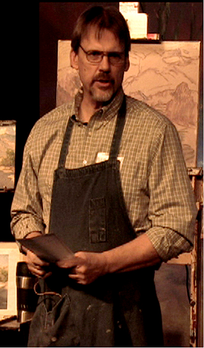
 In my newsletter I’ve been talking about changes coming to my teaching materials and this month the first of those new materials have become available. So if you get my newsletter, you know what I’m talking about. I’ve put together topical lessons to address individual challenges artists face. The lessons come with a video demonstration, but along with the demonstration I include a lesson plan for continued study and application. These new topical lessons are available in two ways. If the lessons are ordered through the mail, a three-ringed binder will be sent with the first lesson ordered so that lesson and any subsequent lessons ordered can be kept together to help with organization. The second way the lessons can be ordered is through “direct download”. A notebook does not come with the download format, but there aren’t any shipping costs with the download option. New “Full Length Feature Demos” are coming as well. So a lot is happening over at Starke Studio. Stop by and check out the new stuff now at www.StarkeStudio.com.
Composing Your Painting with Abstract Patterns
 Today’s post is about composing with abstract patterns. We all have the urge to fall in love with detail when we see a subject we want to paint. It’s natural, something were born with, (or cursed with). But detail is the death knell to composition. There is no pattern in detail, it doesn’t hang together in masses. It breaks up the painting into small little brush strokes that is hard for the viewer to sort through. If we can get away from realism at the start of a painting and see things abstractly in groups Continue Reading
Sparking The Creative Process
 I think most of us have ideas for paintings floating around in our heads but because we’re used to painting from a photograph or having the subject in front of us all the time we don’t feel confident enough to pull off a painting from memory or ideas for a painting that we think will work.
Doing small color studies can help work through those ideas and can even generate new ones. I generally work out an idea with Continue Reading
Discussing Color Schemes – Part 2
 Paintings with a complementary color scheme use complements as the overall predominant color in the painting. Like orange and blue, green and red, violet andyellow. This also includes the in-between colors on the color wheel, like red-orange and blue-green or blue-violet and yellow-orange. It’s not a calming or peaceful scheme like the analogous colors which pick colors next to each other on the color wheel. Complements are opposites and can be jarring or more unsettling.Continue Reading
Discussing Color Schemes – Part 1
 The trouble with painting from color photoraphs is the color in the photographs. It’s usually not very good even though with digial technology it’s certainly better but not as good as seeing the real thing. A good way of dealing with photographic color is to work in color schemes. Picking a scheme that best represents the mood or lighting in your reference. For instanced an “analogous color scheme“ Continue Reading
Pushing The Limits of What you Can Do
In painting or any kind of discipline, you’re either moving forward or slipping backwards, there’s no standing still. Staying in a comfort zone in your painting or subject matter is a good way to become stagnet. Pushing yourself beyond what you think you can do is important. Even if your attempts fail most of the time, you’re still moving ahead. It forces you to try different techniques, solve problems and come up with solutions you hadn’t thought of before. It also forces you to study different paintings, to see how other artists solve the same problems.