Uncategorized Archives - Phil Starke Studio

Category Archives for Uncategorized

Trying A Different Medium

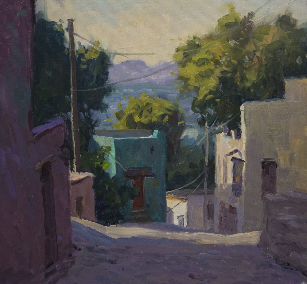
Oils are considered the best medium for learning how to paint because there are forgiving (you can scrap them off) and you can work with them for a period of time before they dry. Acrylic and watercolor need a basic understanding of color and values first, because every stroke is permanent. The same with pastels, all the mixing and layering is on the paper.

In art school I focused on oils, but I had to do some work in acrylic, watercolor and pastels. The idea being that you reinforce, and have better understanding, of what you know by trying different mediums. When I move from oils to pastels or watercolor it helps me see that the same aspects are important in both. It keeps me from getting too caught up in technique and think more about what's important; design, values, patterns and color temperature.

Continue Reading

Adjusting Values

Values make our paintings work, so if the values in photographs are not always reliable we have to have a way to adjust the values in our painting. Here is an explanation at my thought process with values.  

The Illusion of Depth

In this latest video I talk about what it takes to take a 2-dimensional surface and make it feel 3-dimensional.  Since we paint on a flat surface, it’s important to understand how to create an illusion of objects receding. This is a quick look at that illusion.


Seeing Abstractly

This is a quick look at why its helpful to think abstractly when painting representational subjects.

Painting A Street Scene

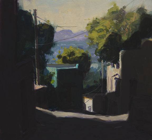
When painting a street scene, or even a rural area with buildings and structures, there are elements involved that make things a little more complicated. First is linear perspective, finding the horizon line and the vanishing points to give the buildings and roads depth. There are a lot of small simple books online that explain artistic perspective, easy to read and understand. Just a simple understanding is all you need. John Carlson’s Guide to Landscape Painting has a good chapter on linear perspective. But the most important part is simplifying the scene. Finding that overall shadow pattern that sets up the larger shapes and makes it easier to paint. It’s easier to see the whole composition and set up the drawing with an overall shadow pattern.

Always working with large shapes first, getting the right value and color relationships, then working smaller deciding what details to use and what to leave out.

It’s a good idea to do a smaller value study first, using ivory black and white or raw umber and white. This way you can concentrate on the values without thinking about color. Remember values are always more important than color. Then do a color version, using the value painting to check the values of your color.

Using Color Schemes

Just taking a moment to talk about Color Schemes.  I know they can be a bit confusing, so here’s a little help.

Ash Can School of Painting

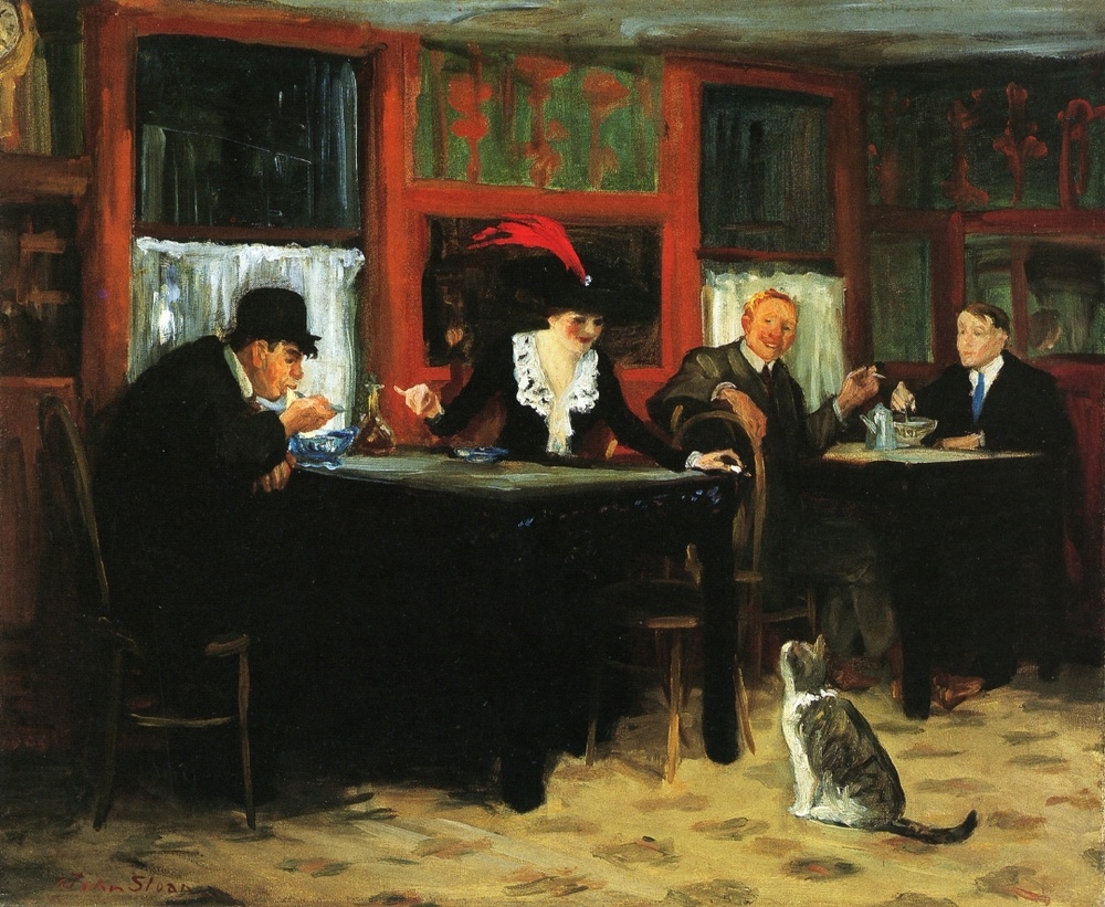
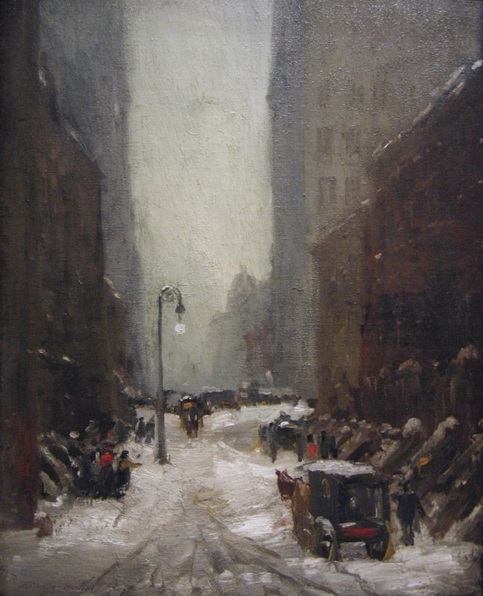
About 1900, a group of Realist artists set themselves apart from and challenged the American Impressionists and academics. The most extensively trained member of this group was Robert Henri (1865–1929), who had studied at the Pennsylvania Academy of the Fine Arts from 1886 to 1888 under Thomas Anshutz (1851–1912). Anshutz had himself studied at the Pennsylvania Academy from 1876 to 1882 with Thomas Eakins, who had defied Victorian decorum in his teaching principles and in his boldly realistic paintings. After spending the years from 1888 to 1891 working at the Académie Julian in Paris, Henri taught at the School of Design for Women in Philadelphia and gave private art classes in and around that city and, during return visits to France, in and around Paris. Beginning in 1892, Henri also became the mentor to four Philadelphia illustrators—William Glackens (1870–1938), George Luks (1866–1933), Everett Shinn (1876–1953), and John Sloan (1871–1951)—who worked together at several local newspapers and gathered to study, share studios, and travel. Between late 1896 and 1904, they all moved to New York, where Henri himself settled in 1900.

Continue Reading

Dwight Tryon 1849- 1925

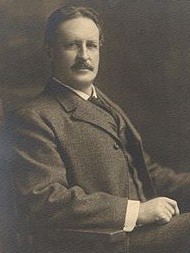
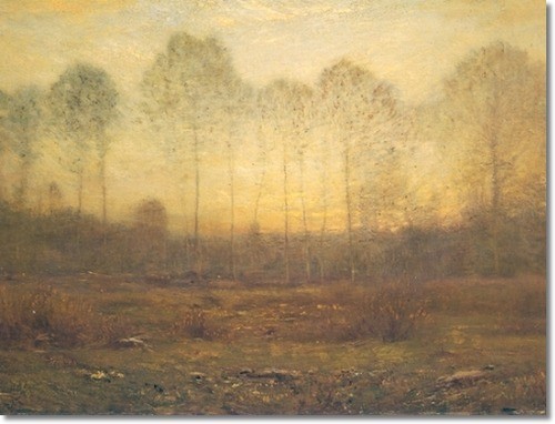
One of the most prominent of American Tonalist painters, Dwight Tryon was born in Hartford, Connecticut in 1849.  Though largely self-taught, he achieved enough early success painting in a Hudson River style to afford a trip to Europe in 1876. In France, he studied with Henri-Joseph Harpignies and J. B. Antoine Guillemet, but a decisive event in the evolution of his style was a summer spent studying with Barbizon artist Charles-Francois Daubigny. Upon his return to the United States in 1881, he took up residence in New York City. His search for more picturesque settings, however, led him to the fishing village of South Dartmouth, Massachusetts, where he summered and eventually built a small house. Among the artists he met in New York were Thomas Wilmer Dewing and Robert Swain Gifford, with whom he remained close friends.

Like many of his Tonalist peers, Tryon preferred intimate and lyrical low-light landscapes of rather simple composition. In a statement quoted in a biography published shortly after his death, he summarizes the method which gives his work an uncanny dynamism: “Often in painting a bit of sky, I will put blue on it and scrape it off; I will put pink on it and scrape it off; I will put yellow on it and scrape it off; I will put green on it and scrape it off, and my sky will look almost white-but it isn’t, for it will have in it the vibrations of all those colors.

exc-5548f82de4b08ecb6653bcfe

The Difference Between Painting Outside and Painting in the Studio

One of the problems students have in a plein air workshop is trying to make their paintings look like a studio painting. For me painting outside and painting inside are 2 totally different approaches.

When I’m painting outside I’m in practice mode, more so then in the studio. I’m gathering material for larger studio pieces, trying different approaches to color and brushwork, and responding quicker to what the light is doing to my subject. Detail is at a minimum. I do better if I set a time limit to keep things simple and to the point.

Studio painting is more methodical. I spend a lot more time composing and recomposing my subject, more so than outside. Design becomes really important, it’s what carries the painting. I will also give more thought to a color scheme or mood that I want to create.  Outside is more about responding to what’s there. Work in the studio generally has more broken color and more attention to edges.

The big difference is the atmosphere, being outside and seeing real color as opposed to being inside with photo references and color sketches. It’s a different thought process. I like both equally, they just have different purposes.

Emile Gruppe on Values and Eye Fatigue

Emile Gruppe painted in and around Gloucester, Massachusetts in the early and mid 20th century. I saw a lot of his work when I was in Chicago and I really liked his strong color and bold brush work. Later I came to realize that it was his accurate use of values that made his paintings so strong.

While we’re drawn to paintings by the use of color, it’s the value relationships between the large shapes that make a painting work.  When I’m unhappy with the color in my painting, 9 times out of 10 it’s the values that are off, not the color.  When my values are off in my paining it’s usually because I’m looking right at the area I’m trying to mix and the more I stare at the value the worse it gets. When I was told to look at the values next to the value I wanted to mix, then I could get the right value relationship in the painting. This is also true with color.

Gruppe described it as eye fatigue. He has a good paragraph in his book, “Gruppe On Color” that talks about comparing values and color:  “You might think that the best way to analyze an area of color is to stare at it intently. But that’s just the wrong way to do it. The longer you stare at an area, the grayer it gets. Your eye becomes used to the color; it fatigues; your sense of color dies. The only way to judge color (and value) of an object is to compare it with the color of objects near it.”

Lets say, for example, that you want to determine the color of the sky at the horizon. It can be anything from purple to green. But to see it, you should first look over your head for a few seconds at the color of the zenith. Then quickly lower your eyes. For a few seconds , you will see vivid color near the horizon. Then the color will quickly fade. That’s why I constantly move my eyes over a scene, comparing values and colors.” — Emile Gruppe- Gruppe on Color.